Israel-Gaza: Why is this region confused on Google Maps?
Periskopi (5 years ago)
Why is Gaza, one of the most densely populated countries in the world, so turbulent on Google Maps? This issue is highlighted by researchers who use open-source information sources including maps data to locate the attacks and document the disasters that are being [...]
The issue is highlighted with great emphasis by researchers using open-source information sources including maps data to locate the attacks and document the destructions under way.
The fact that we don't have high-quality satellite images from the territories of Israel and Palestine repels us,” said Samir, a researcher for open sources, the BBC reports, translates Periscopi.
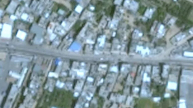
In fact, most Israeli and Palestinian territories are presented on Google Maps with satellite images of low resolution, even though high-quality images are accessible to satellite companies.
But it's almost impossible to see cars in Gaza City.
Why are satellite images important?
The use of satellite images has become a vital element in conflict reporting.
In recent Middle East confrontations, researchers are looking at forms to locate missile fires targeting buildings in Gaza and Israel, using satellites.
However, on Google Earth, the most popular image platform, the latest images for Gaza are low and thus turbulent resolutions.
The last <x0) images from Google Earth are from 2016 and look like shit. I approached the view in some rural areas of Syria and has only 20+ images from that time, in high resolution,” said Aric Toler, a journalist from Bellingcat.
Google says its goal is <x0th) it makes dense areas with updated populations [in view] on regular ground” but that's not how it happened with Gaza. /Periscope