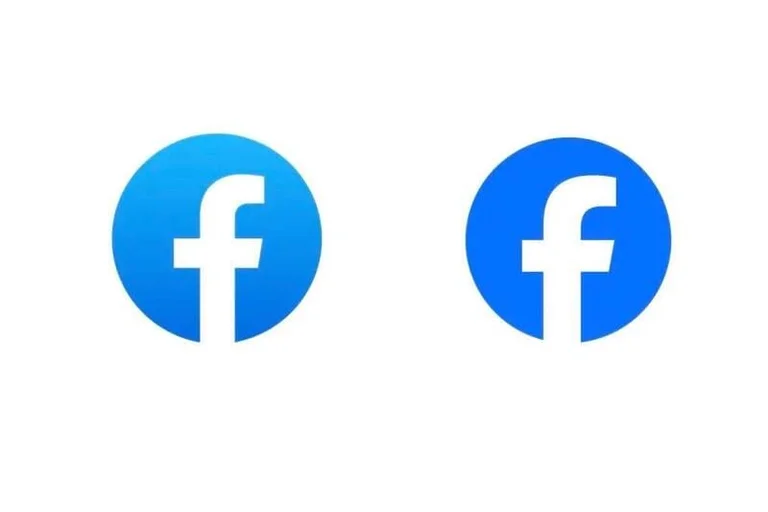
Facebook changed its logo, do you see the difference?
Periskopi (3 years ago)
Meta company is changing <x0 identity system” of the social Facebook network, and this includes changing logo view. However, change is not very obvious, except that blue is much darker and letters “f” have been changed delicately. “Our goal was to create a updated logo design [...]
However, change is not very obvious, except that blue is much darker and letters “f” have been changed delicately.
Our “Our aim was to create a updated Facebook logo design that is more courageous. Each of the new improvements leads to greater harmony throughout design as a key element of app identity. We did this by more clearly expressing the Blue Seed which is visually the most accessible on our app and offers a stronger contrast to the letter offé to make it distinguish”, Meta reported.
Although the changes are delicate, however, it makes sense for Meta to refresh the Facebook logo instead of fully re-diagnosing it. The company says that the social network has 2 billion users active a day, which means that any visual change will be seen by many. Understandably, therefore, Meta chooses relatively minor changes to one of the most well - known logos.
Meta also changed the view of the font used to write the social network name and used the personal letters Facebok Sans. There is also a new range of colors dominated by blue shades, and the image of the emoticon Reactions has also been changed.

The company says this is only the first phase of updateing Facebook identity.